
利用CSS制作手机充电动画
Posted on: 2022年4月7日 at 03:15 
这是一篇发布于 698 天以前的旧文,其中的部分内容可能已经过时。
html
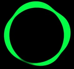
<div class="mask">
  <div class="circle"></div>
</div>
css
.mask {
  width: 300px;
  height: 400px;
  overflow: hidden;
  background-color: #000;
  filter: contrast(15) hue-rotate(0);
  animation: hueRotate 10s infinite linear;
}
.circle {
  position: relative;
  width: 300px;
  height: 300px;
  filter: blur(8px);
  box-sizing: border-box;
}
.circle:before {
  position: absolute;
  top: 40%;
  left: 50%;
  z-index: 10;
  width: 176px;
  height: 176px;
  background-color: #000;
  border-radius: 50%;
  content: '';
  transform: translate(-50%, -50%);
}
.circle:after {
  position: absolute;
  top: 40%;
  left: 50%;
  width: 200px;
  height: 200px;
  background-color: #00ff6f;
  border-radius: 42% 38% 62% 49%/45%;
  content: '';
  transform: translate(-50%, -50%) rotate(0);
  animation: rotate 10s infinite linear;
}
@keyframes rotate {
  50% {
    border-radius: 45%/42% 38% 58% 49%;
  }
  to {
    transform: translate(-50%, -50%) rotate(720deg);
  }
}
@keyframes hueRotate {
  to {
    filter: contrast(15) hue-rotate(360deg);
  }
}